51 Introduction to ggplot2
ggplot2, created by Hadley Wickham (Wickham 2011), follows the Grammar of Graphics approach of Leland Wilkinson (Wilkinson 2012). It therefore features a very different syntax from base R graphics functions seen in Chapter 49. It is based on the grid graphics package, which, perhaps confusingly, is included in base R.
The general idea is to start by defining the data and then add and/or modify graphical elements in a stepwise manner, which allows one to build complex and layered visualizations. A simplified interface to ggplot graphics is provided in the qplot() function of ggplot2. This chapter focuses on the basics of the ggplot() function, which is more flexible and powerful.
Do not try to combine base R graphics and ggplot2 graphics in the same plot. They are based on different graphics engines and are not compatible.
51.1 Setup
51.1.1 Packages
Load ggplot2
51.1.2 Synthetic Data
library(data.table)
set.seed(2022)
dt <- data.table(
    PID = sample(8001:9000, size = 100),
    Age = rnorm(100, mean = 33, sd = 8),
    Weight = rnorm(100, mean = 70, sd = 9),
    SysBP = rnorm(100, mean = 110, sd = 6),
    DiaBP = rnorm(100, mean = 80, sd = 6),
    Sex = factor(sample(c("Female", "Male"), size = 100, replace = TRUE))
)
dt[, SysBP := SysBP + 0.5 * Age]
dt[Sex == "Male", Weight := Weight + rnorm(.N, mean = 16, sd = 1.5)]
dt[Sex == "Male", Age := Age + rnorm(.N, mean = 6, sd = 1.8)]
dt <- as_tibble(dt)
Define a color palette, palette_, and a version of the same palette at 2/3 transparency, palette_a, for use in plots:
palette_ <- c("#43A4AC", "#FA9860")
palette_a <- adjustcolor(palette_, 0.666)
Confusingly, ggplot2 uses the aes() function, short for aesthetics, to define the plot data.
51.2 Grammar of Graphics
The general syntax of a ggplot command is as follows:
ggplot(data, aes(x, y)) + geom_*() + theme_*() + scale_*()Where:
-
datais the data frame or tibble containing the data to be plotted. -
aes(x, y)defines which variables are mapped to which axes, etc. as well as other mappings, like color, shape, size, etc. -
geom_*()specifies the type of geometric object to be used for the plot, such as points, lines, bars, etc. -
theme_*()allows customization of the plot’s appearance, such as background, grid lines, text size, etc. -
scale_*()allows customization of the scales used for the axes and other aesthetics, such as color scales, axis limits, etc.
51.3 Box plot
ggplot requires a categorical x-axis to draw boxplots. This means we need to convert our dataset from wide to long format.
dt_long <- dt |> pivot_longer(
    cols = c("SysBP", "DiaBP"),
    names_to = "Measure",
    values_to = "Value"
)
dt_long
# A tibble: 200 × 6
PID Age Weight Sex Measure Value
<int> <dbl> <dbl> <fct> <chr> <dbl>
1 8228 28.5 82.2 Male SysBP 122.
2 8228 28.5 82.2 Male DiaBP 79.1
3 8435 50.1 72.6 Female SysBP 136.
4 8435 50.1 72.6 Female DiaBP 84.3
5 8718 31.0 73.0 Female SysBP 124.
6 8718 31.0 73.0 Female DiaBP 78.1
7 8823 30.0 77.5 Male SysBP 126.
8 8823 30.0 77.5 Male DiaBP 80.9
9 8843 40.5 86.7 Male SysBP 133.
10 8843 40.5 86.7 Male DiaBP 68.6
# ℹ 190 more rowsp <- ggplot(dt_long, aes(Measure, Value)) +
geom_boxplot()
p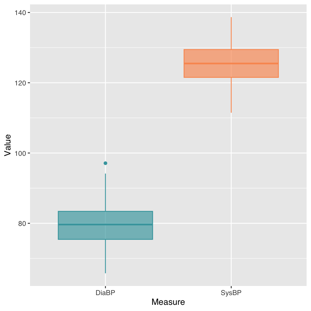
We can specify color and fill to change the color of the boxplot border and fill, respectively.
p <- ggplot(dt_long, aes(Measure, Value)) +
    geom_boxplot(color = palette_[1:2], fill = palette_a[1:2])
p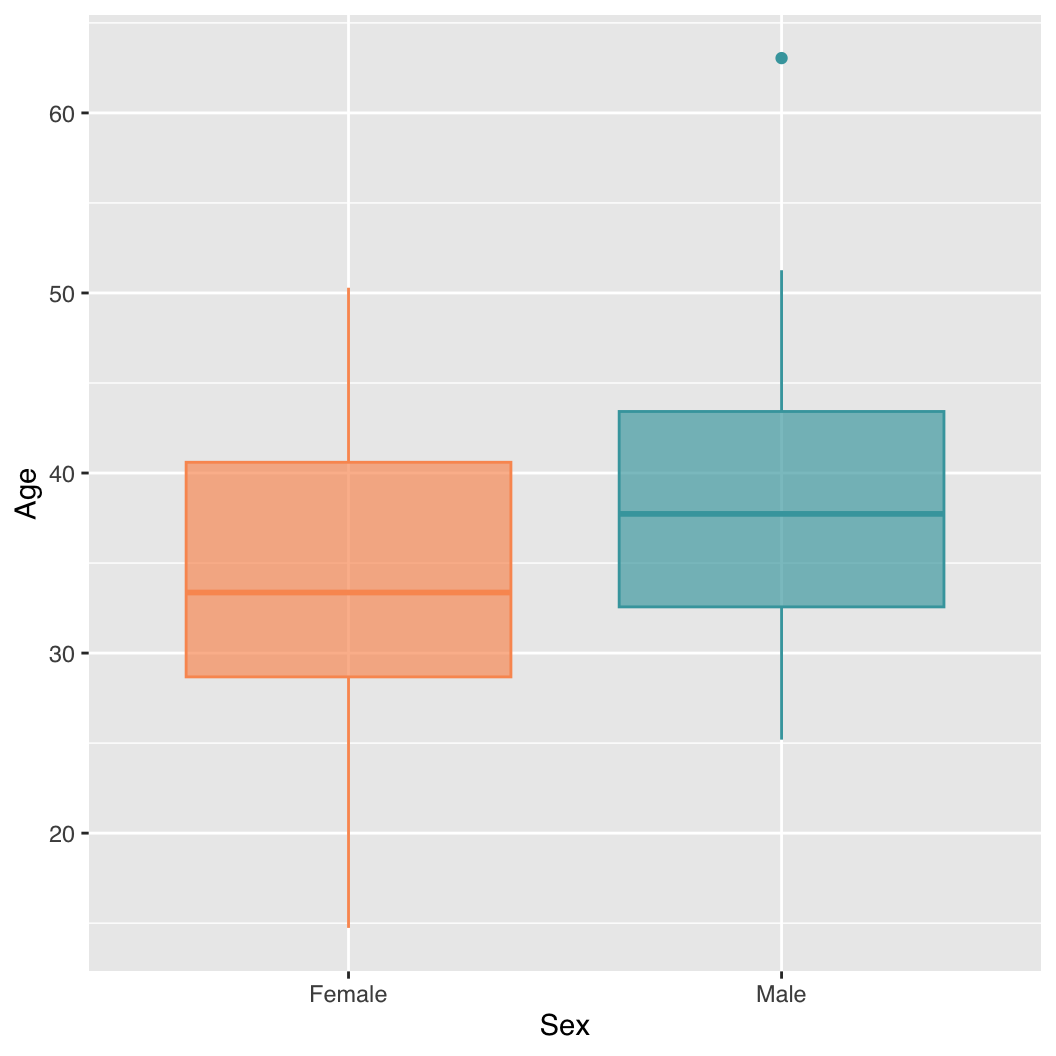
51.3.1 Grouped boxplot
p <- ggplot(dt, aes(x = Sex, y = Age)) +
    geom_boxplot(colour = palette_[2:1], fill = palette_a[2:1])
p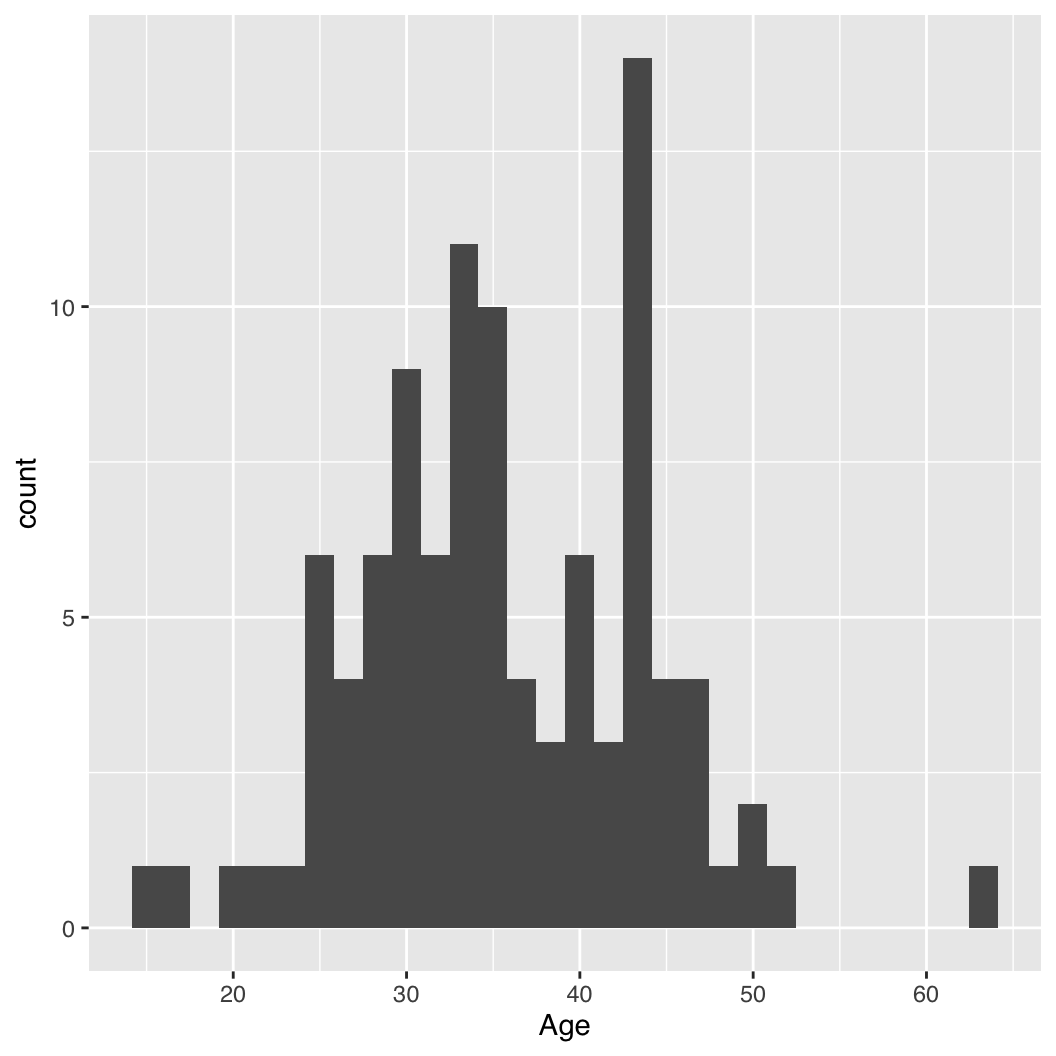
51.4 Histogram
p <- ggplot(dt, aes(Age)) +
    geom_histogram()
p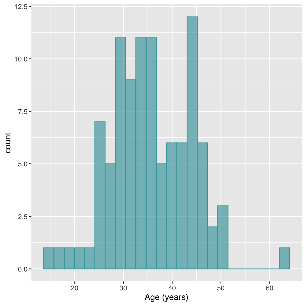
We can specify the number of bins to use with the bins argument and the border and fill colors with color and fill, respectively, as above. xlab() can be used to define the x-axis label.
p <- ggplot(dt, aes(Age)) +
    geom_histogram(bins = 24, color = palette_[1], fill = palette_a[1]) +
    xlab("Age (years)")
p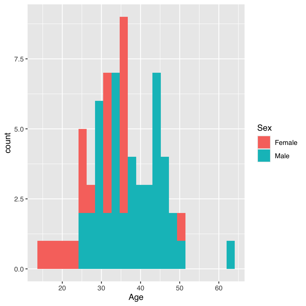
51.4.1 Grouped Histogram
p <- ggplot(dt, aes(x = Age, fill = Sex)) +
    geom_histogram(bins = 24, position = "identity")
p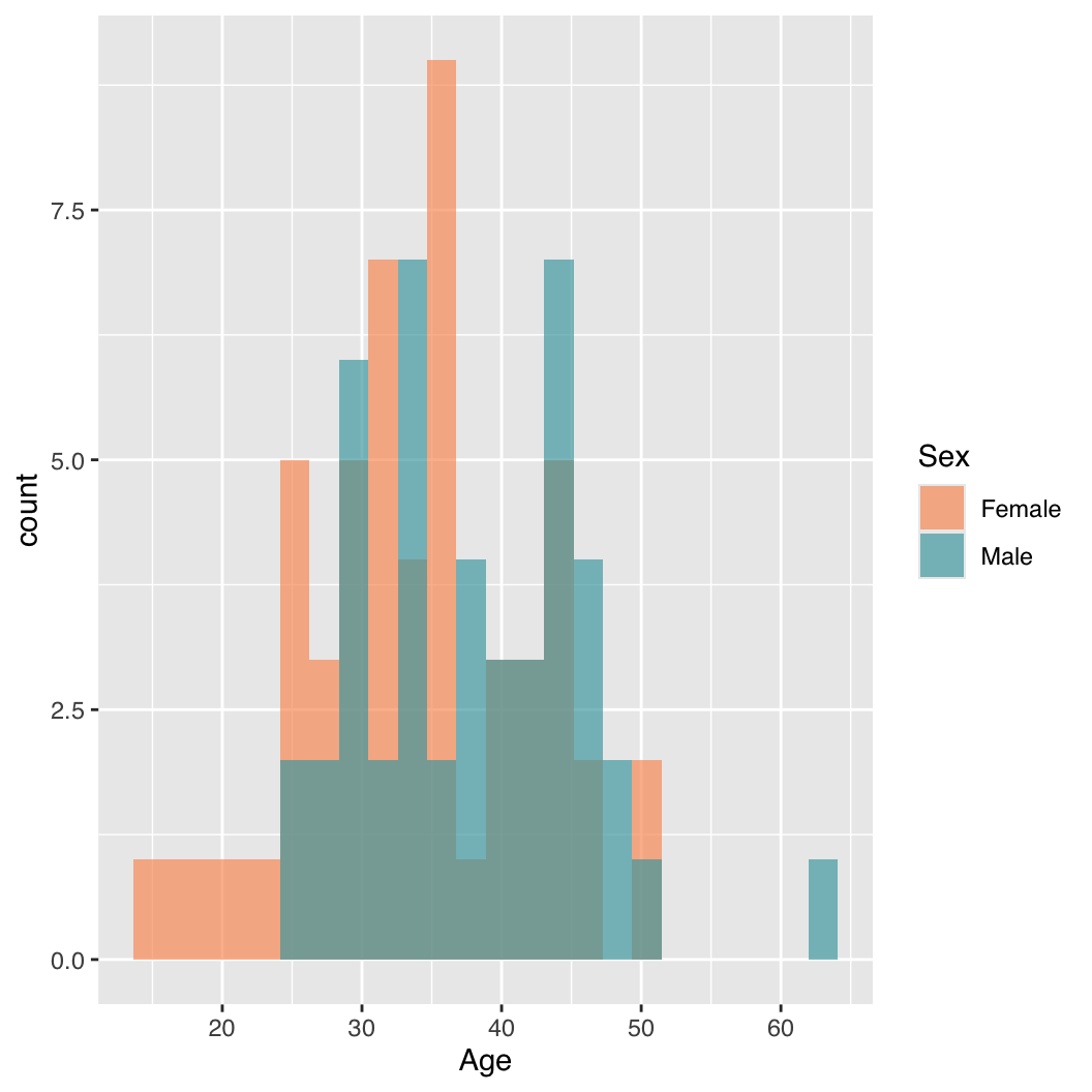
scale_fill_manual can be used to define the colors of the bars:
p <- ggplot(dt, aes(x = Age, fill = Sex)) +
    geom_histogram(bins = 24, position = "identity") +
    scale_fill_manual(values = palette_a[2:1])
p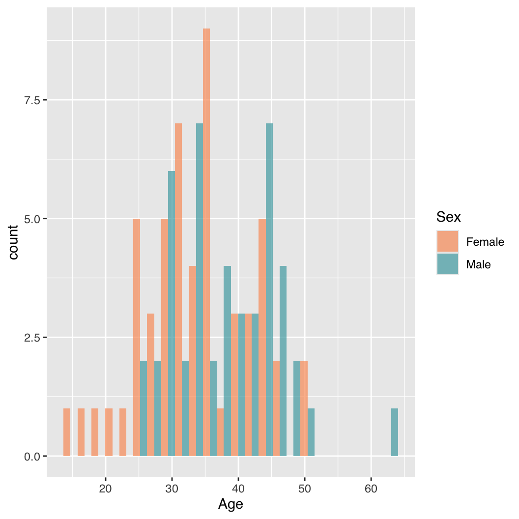
position = "identity" displays overlapping bars. Alternatively, position = "dodge" can be used to display groups’ bars side by side instead. Finally, position = "stack", is the (unfortunate) default and results in vertically stacked bars, which can be useful for showing totals but otherwise confusing.
p <- ggplot(dt, aes(x = Age, fill = Sex)) +
    geom_histogram(bins = 24, position = "dodge") +
    scale_fill_manual(values = palette_a[2:1])
p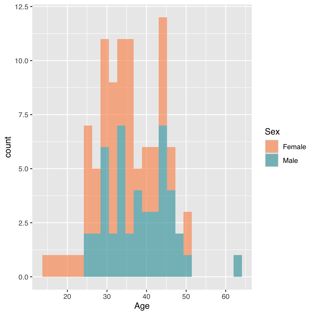
p <- ggplot(dt, aes(x = Age, fill = Sex)) +
    geom_histogram(bins = 24, position = "stack") +
    scale_fill_manual(values = palette_a[2:1])
p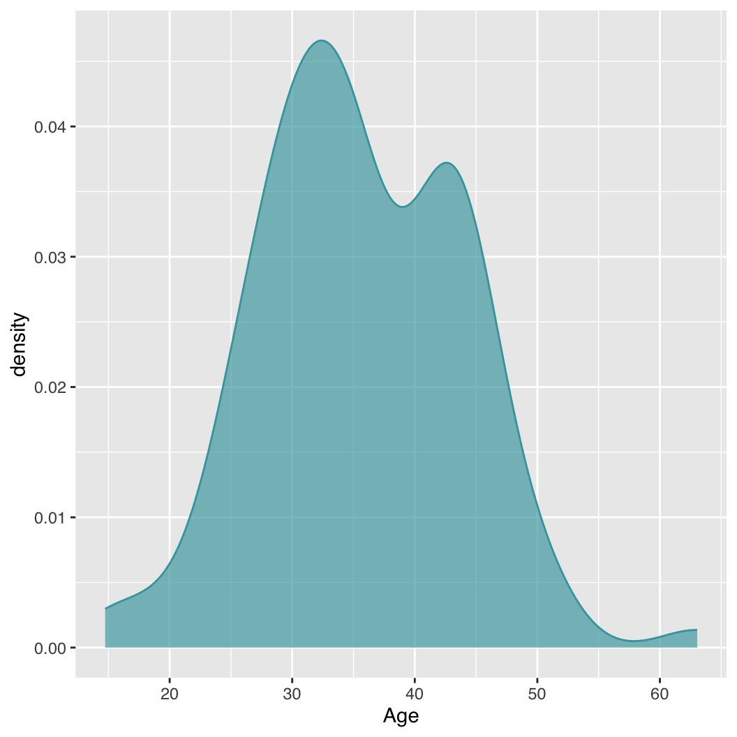
51.5 Density plot
p <- ggplot(dt, aes(x = Age)) +
    geom_density(color = palette_[1], fill = palette_a[1])
p
51.5.1 Grouped density plot
p <- ggplot(dt, aes(x = Age, fill = Sex)) +
    geom_density(color = NA) +
    scale_fill_manual(values = palette_a[2:1])
p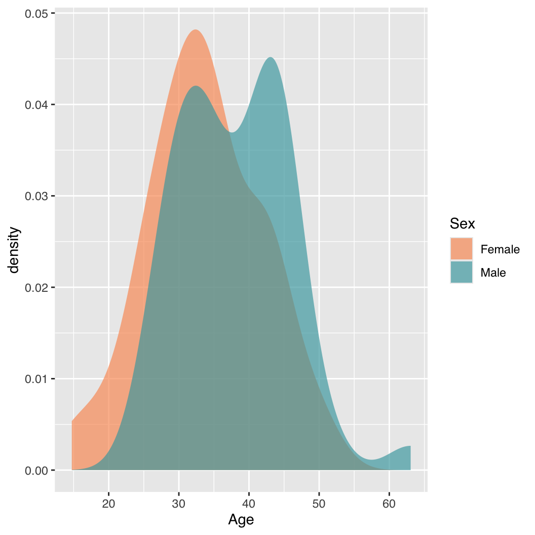
51.6 Barplot
schools <- data.frame(UCSF = 4, Stanford = 7, Penn = 12)ggplot2 requires an explicit column in the data that define the categorical x-axis:
schools_df <- data.frame(
    University = factor(colnames(schools),
        levels = c("UCSF", "Stanford", "Penn")),
     N_schools = as.numeric(schools[1, ])
)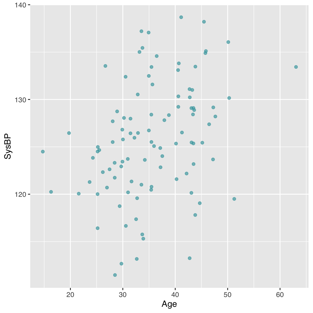
51.7 Scatterplot
p <- ggplot(dt, aes(Age, SysBP)) +
    geom_point(color = palette_a[1])
p
51.7.1 Grouped Scatterplot
p <- ggplot(dt, aes(Age, SysBP, col = Sex)) +
    geom_point() +
    scale_color_manual(values = palette_[2:1])
p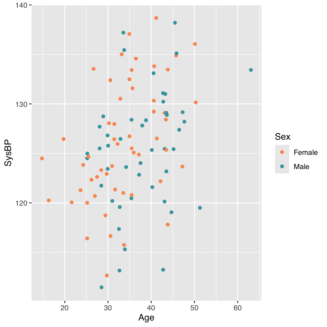
51.8 Themes
ggplot2 includes several built-in themes that can be applied to plots to change their overall appearance. The default theme is theme_grey(), but other popular themes include theme_minimal(), theme_bw(), and theme_classic().
p <- ggplot(dt, aes(Age, SysBP)) +
  geom_point() +
  theme_minimal() # or theme_bw(), theme_classic(), etc.
51.9 Faceting
Faceting allows you to create multiple plots based on the values of one or more categorical variables. This is useful for comparing distributions or relationships across different groups.
p <- ggplot(dt, aes(Age, SysBP)) +
  geom_point() +
  facet_wrap(~Sex)
p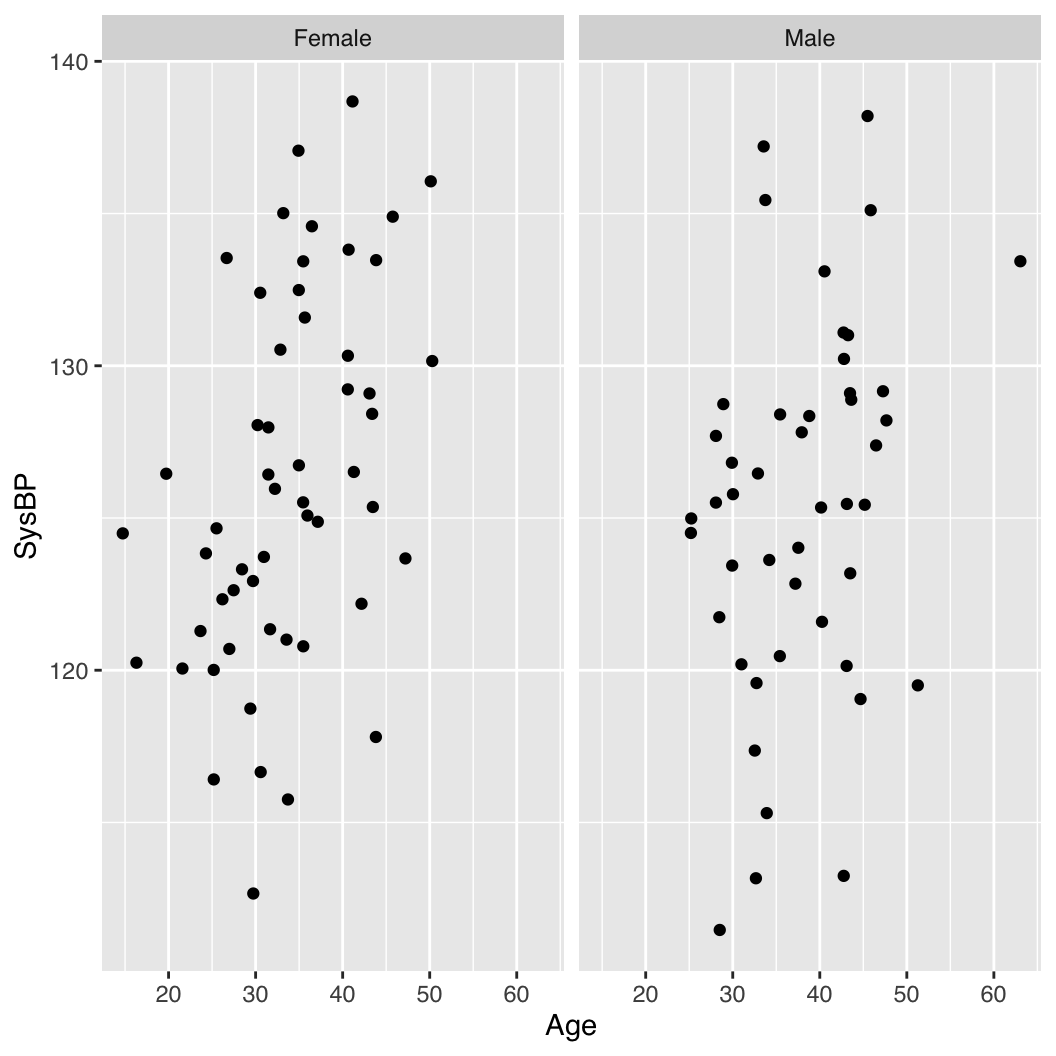
51.10 Adding labels
p <- ggplot(dt, aes(Age, SysBP)) +
    geom_point() +
    labs(
        title = "Systolic BP vs Age",
        x = "Age (years)",
        y = "Systolic BP (mmHg)"
    )
p
51.11 Save plot to file
We’ll use the grouped boxplot example from above to show how to save each type of plot to file, using a PDF output as an example.
p <- ggplot(dt, aes(x = Sex, y = Age)) +
    geom_boxplot(colour = palette_[2:1], fill = palette_a[2:1])
ggsave("Age_by_Sex_ggplot.pdf", p,
    width = 5.5, height = 5.5, scale = 1, units = "in")
51.12 See also
- Base R Graphics (Chapter 49)
- Introduction to plotly (Chapter 52)